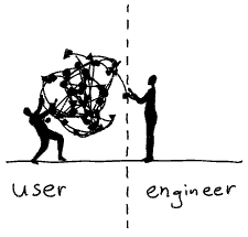
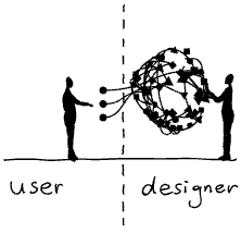
Ralph Ammer’s Make me think! has some gifs which get shared frequently: a user and a designer, complexity tamed into something navigable. The designer as translator. It’s satisfying, and the first half of the article earns it. But it also implies a handoff: engineer builds system, designer makes it usable.
 vs
vs
The reverse handoff fails in a similar way: designer makes simple-looking screens, engineer tries to build the system that can make them real. In both cases, the interface is treated as something that happens after the hard part, or before it, rather than as part of the same problem.
The part of Ammer’s article that gets shared less is where he pushes past translation and into the cost of hiding complexity. He argues that over-simplification creates dependence and blindness; that when we hide complexity entirely, users lose the ability to understand, recover from failure, or appreciate what’s actually happening. The simpler the interface, the more it conceals. And concealment has costs.
What he doesn’t quite answer is why simplification so often goes wrong in this way. Rob Haisfield has a useful frame for the failure mode: Easy to learn, hard to use. Software that’s immediately approachable but frustrating to live with. Controls that feel intuitive until you try to do something specific or slightly more complicated interesting.
The best interfaces aren’t the product of a handoff. They’re the product of a negotiation between what the system can do, what users need to understand and control, and where the complexity should live.
The goal of that negotiation isn’t compromise. Splitting the difference between a powerful system and a simple interface just gives you something that’s neither.
The goal is synthesis: an abstraction that genuinely serves both, that makes the user feel more capable. Sometimes that means making something feel easy. Sometimes it means designing for mastery.